The short answer: choose red roses when you want the message to feel deliberately romantic. Pink, dusty pink and apricot usually feel softer and more personal. Yellow and orange bring brightness and energy; white and cream feel calm and clear. Even so, what matters is not some supposedly binding colour code, but the person receiving the roses.
If you know their favourite colour, that is almost always the best place to start. Without that clue, let the occasion, your relationship and the mood you want to create guide you. Rose colour then becomes a useful way to choose – not a test in the language of flowers.
Rose colours are a guide, not a secret code
Roses have long been associated with love and affection. Red roses in particular are a familiar romantic gesture today. Other colour meanings come from different periods and cultures; they have been passed on, altered and sometimes interpreted in contradictory ways.
That is why rose colours work better as expressions of mood than as fixed promises. A pale pink can feel gentle, a deep red dramatic and a warm orange lively. The person receiving them may still read them quite differently. Roses do not, after all, come with an instruction leaflet.
Which rose colour suits which occasion? The short version
- For an explicitly romantic gesture: red or a deep, dark red, when that intensity is exactly what you intend.
- For a birthday, a thank-you or warm affection: pink, dusty pink, apricot or peach tones feel warm, but less unequivocally romantic.
- For encouragement and spontaneous joy: yellow and orange create a bright, lively impression.
- For a calm or celebratory occasion: white, cream and very pale shades feel clear, restrained and elegant.
- For an especially personal choice: the recipient's favourite colour, or a mix that suits their style.
This is not a catalogue of etiquette. It describes how colour groups often come across. If a colour holds a shared memory for you, that personal meaning matters more than any inherited list.
Red: a strong message that rarely feels neutral
Red roses are the clearest choice for Valentine's Day, an anniversary or a declaration of love when you explicitly mean the gesture romantically. Precisely because that association is so familiar, red should not be treated as a neutral default. For a new acquaintance, in a professional setting or whenever you want to avoid ambiguity, another shade may feel more relaxed.
Red is not a single colour either. A clear, vivid red feels direct; deep burgundy feels weightier and more formal. Coral or berry tones soften the palette a little. You can make the romantic direction stronger or gentler without changing the type of flower.
Pink, apricot, yellow and orange: warmth with different energy
Pink and dusty pink
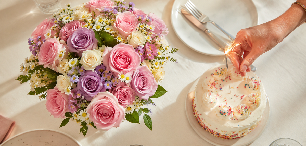
Pink roses work well when affection should be felt, but the gesture should be less explicit than a red bouquet. Pale pink feels light and friendly; dusty pink quieter and more grown-up. Either can suit a birthday, a thank-you or a caring gesture, regardless of the recipient's gender.
Apricot and peach tones
Apricot sits between soft and warm. It feels less cool than pale pink and less loud than vivid orange. That makes it a good choice for personal congratulations, for an invitation or for a gesture that should feel heartfelt without becoming grand.
Yellow and orange
Yellow and orange roses stand out through their brightness. They suit a bouquet intended to feel cheerful, energetic or informal – for a birthday, a little encouragement or simply because. Rather than trying to decode an old symbolic meaning, ask the simpler question: does this person like strong, warm colours?
White and cream: context matters especially
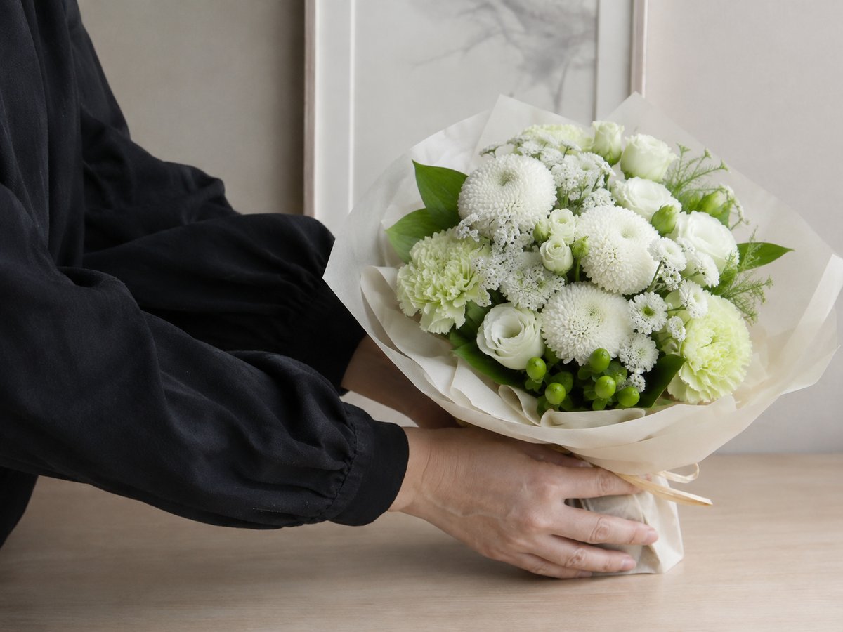
White and cream roses feel clear, calm and often a little more formal. They can suit a wedding, a celebration or a quiet gesture of appreciation. Cream softens the starkness of pure white; green, blush pink or apricot as accompanying colours can warm the composition.
Pale colours in particular are read differently across cultures and by individuals. If you are unsure, use the card, the other colours and the occasion to give the bouquet a clear frame. That way, no single colour has to carry the whole message.
One colour, tonal or mixed?
It is not only the colour you choose but also how you combine it that changes the impression. A bouquet in a single rose colour feels focused and makes a clear statement. Tonal combinations – powder pink, dusty pink and a berry accent, for example – remain harmonious while feeling more layered.
A colourful mix feels livelier and pushes rigid colour codes into the background. To keep it from becoming busy, use a small number of main colours and a visible thread connecting them. Colour temperature matters too: a cool blush looks different from a peach-warm pink, even though both might be given the same everyday colour name.
Three questions make finding the right rose colour easier
- What does the recipient genuinely like? Their favourite colour, interior style and previous flower choices are better clues than a general symbolism guide.
- How should the gesture feel? Romantic, cheerful, calm, celebratory or entirely informal – the intended mood narrows the palette.
- How explicit should the message be? A single-colour red bouquet speaks clearly; soft gradations or a mix leave more room for interpretation.
If you would like to compare the effect directly, browse our rose bouquets. Start with what you want to express, then choose the shade that suits this person. The best rose colour is not the one with the longest legend behind it, but the one that feels clearly chosen for them.